
What it means Branding? Branding or Brand Management It is a brand management strategy that aims to make it more recognized by its audience and present in the market. The strategy seeks admiration and desire for the values that the brand creates around itself.
One of the most important strategies for Fundraising or Fund-raising, is Explore the Branding or the Rebranding, at your institution. Rebranding is the name given to strategic actions that seek to reposition a brand in the market according to consumer perception..
The practice is constantly adopted by organizations that have some difficulty in presenting their brand or that seek to venture into new markets.
Branding it is, in fact, much more than just aesthetics. A good brand can convey emotion and attract supporters and donors. A good brand becomes synonymous with your organization to the point where you can only use your logo to inspire action.
Lembre-se, a marca leva tempo para compensar. Uma aparência consistente e uma mensagem acabarão por funcionar a seu favor. Sarah Dunham, president of Big Duck, commented that “50% of nonprofits that rebrand report an increase in revenue over a three-year period.”
Tente manter sua mensagem focada em sua marca. Isso inclui o uso consistente de cores, logotipos e fontes e outros estilos.
Vire um olhar crítico para sua marca atual para garantir que ela ainda seja consistente com sua mensagem. O conteúdo antiquado deve ser atualizado.
You might consider doing this when making major website updates, changes to your mission statement, or with a new overall marketing strategy.
Examples of visual identities that have been redesigned
1 – Visual Identity – Starbucks

Firstly, in 2011, the well-known coffee franchise Starbucks made significant changes to the visual identity of its products. The company was going through a period of recession, and consequently, a decrease in the number of sales.
Dessa maneira, a empresa tomou a decisão de explorar outros mercados , vendendo diferentes produtos (canecas, camisetas, sorvetes…) inclusive fora de suas lojas. Por conta dessa decisão, a palavra coffee (café) foi removida do logo. Outrossim, uma equipe criativa teve a missão de renovar a imagem da marca, repaginando também sites, embalagens, e todos os canais de comunicação. O resultado? Um aumento progressivo no número de vendas, expansão de mercado, e estabelecimento dela como umas das top of mind in the coffee shop segment.
2 – Visual Identity – Pabst Blue Ribbon

The drink is not very well known here, but for you to understand what it is about, until some time ago Pabst Blue Ribbon (PBR) was synonymous with the perfect American drink for those people who work hard at work and want a cheap beer at the end of the day. day.
When launched in China, the visual identity was reformulated, and, unlike the American version, its packaging and logo they gained more sophisticated airs.
After all, for you to better understand yourself, China is the largest beer market in the world, according to Euromonitor, and it is there that the greatest demand is for high-end alcoholic beverages. In this context, the reformulation of Pabst Blue Ribbon placed the brand in a position favorable to the Chinese taste for expensive beers. Therefore, if, in the USA, they were sold for no more than 2 dollars, in China, the price is, at least, U$44. Excellent example of a visual identity that knew how to adapt to a new audience!
3 – Visual Identity – Natura

Know more: How to create a company visual identity in 5 steps
First of all, not to say that we only talk about foreign brands, an old but successful case is that of the Brazilian brand Natura. In this sense, in the mid-2000s, the brand decided that it would invest heavily in research and development, new facilities at its headquarters, in e-commerce, and also in the foreign market.
Dessa forma, para este novo momento, a empresa fez pesquisas com colaboradores, consultoras e consumidores que apontavam que a imagem da Natura ideal era de uma personalidade elegante, ativa e atualizada, diferente da passada pela logomarca antiga, com um traço pesado que dava a ideia de algo estático, e tradicional. Logo, a imagem antiga não combinava com a proposta de maior investimento em expansão de negócios e nem com a audiência da marca.
A partir daí, a empresa passou por um processo de reformulação da identidade visual. O resultado foi um logo com mais movimento, leveza e clareza, adequado a proposta de crescimento da empresa, e mais atrativo ao público alvo da marca. Consequentemente, a marca fidelizou o seu público antigo, e passou a ser melhor reconhecida entre seus prospectos.
What to conclude from all this? Companies change and their image must follow these processes. If your company has the opportunity to renew the positioning of the brand image, readapt updates on interests and target audience, and even improve the relationship with the customer base, why not?
A company that knew how to build its entire visual identity online was our client, the Rio restaurant Point do Macarrão. Check out the Noodle CASE Point Video with the testimony of their owners.
Visual identity that deserved a good change
Antes de mais nada, em alguns casos, a empresa não tem interesse em mudar o posicionamento da marca, apenas atualizar o logo. Sendo assim, é sobre esses casos que trouxemos estes novos exemplos de identidade visual.
As you know, the positioning of a company it must be translated at all touchpoints between the brand and the consumer. In this sense, that is why the logo is so important: he is the face, the face, the representation of a brand's personality, however, at times, the logo may become outdated and the brand's positioning or the market itself may change.
Furthermore, what is important to know is that, a logo redesign pode ir de uma revolução total na identidade visual até apenas alguns pequenos ajustes. Nesse caso, depende de cada projeto, do objetivo que a empresa tem e do posicionamento. Dessa maneira, essas mudanças podem trazer vantagens significativas para seu negócio, fazendo com que fique melhor posicionado no mercado e com isso lucre mais.
See more: 10 important tips for your company's visual identity
Let's now look at some brands that have changed their logos over the last few years and are gaining more!
4 – Galvão

5 – Carrefour

6 – Citroen

7 – Choir

8 – Sugarloaf Mountain

9 – Walmart

10 – Vale

11 – Audi

After these cases, we will now present some cases in which it was necessary to modernize the visual identity, mainly because there was a trend for “flat” logos, with less excess and volume.
Que ver mais alguns exemplos de logos? Dê uma olhada neste projeto em que nossos designers criaram 16 exemplos de logo for the company Carousel da Ortopedia.
Examples of modernized visual identity
Antes de mais nada, vale ressaltar que muitas empresas vêm reformulando a sua identidade visual, deixando-a mais moderna e com uma visualização mais clara, principalmente, pelo fato de estarem agregando seus produtos ou serviços a internet. Desta forma, podem utilizar em suas campanhas de marketing um logo que alcance o público online e offline sem interferir a mensagem que deseja passar.
Porém, ao redesenhar seu logo, leve em consideração o reconhecimento que ele já possui no mercado e o objetivo desta modificação. Além disso, a opinião do público deve ser pesquisada, pois o mesmo, geralmente, possui uma carga emocional com a marca e uma mudança brusca pode interferir essa relação. Isto também vale para colaboradores e parceiros.
See below examples of visual identity that has changed, in some cases like the first, radically!
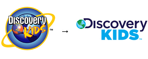
12 – DISCOVERY KIDS

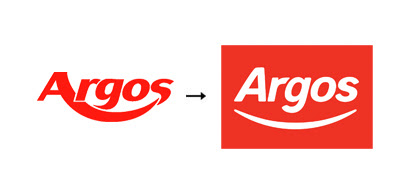
13 – Argos
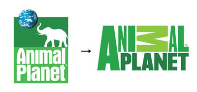
14 – Animal Planet
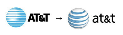
15 – AT&T
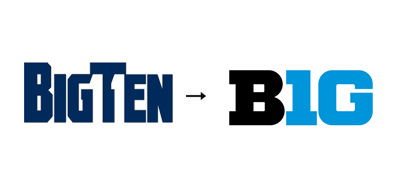
16 – BigTen

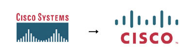
17 – Cisco System

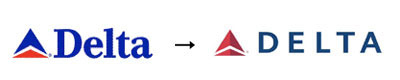
18 – Delta

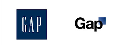
19 – GAP
20 – Google

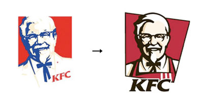
21 – KFC

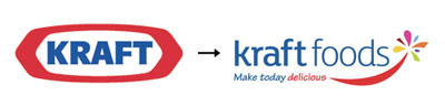
22 – Kraft
23 – MSN

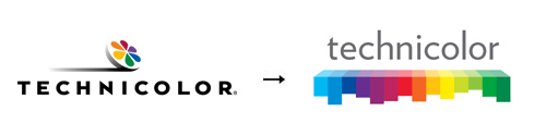
24 – Technicolor

O antigo site da PMP era arcaico, assim como sua aparência geral. Com o tempo, eles evoluíram de uma fundação de pesquisa para uma organização focada em três coisas – informar, pesquisar e curar – então eles precisavam encontrar uma nova abordagem.
NEW BRAND AND HOPE

This refreshed brand is hopeful, with goal-oriented messaging that excites a new generation of donors.
Success in your Fundraising…
Content extracted from the website: Wedologos.
