
What it means Branding? Branding or Brand Management It is a brand management strategy that aims to make it more recognized by its audience and present in the market. The strategy seeks admiration and desire for the values that the brand creates around itself.
One of the most important strategies for Fundraising or Fund-raising, is Explore the Branding or the Rebranding, at your institution. Rebranding is the name given to strategic actions that seek to reposition a brand in the market according to consumer perception..
The practice is constantly adopted by organizations that have some difficulty in presenting their brand or that seek to venture into new markets.
Branding it is, in fact, much more than just aesthetics. A good brand can convey emotion and attract supporters and donors. A good brand becomes synonymous with your organization to the point where you can only use your logo to inspire action.
Remember, branding takes time to pay off. A consistent appearance and a Message will ultimately work in your favor. Sarah Dunham, president of Big Duck, commented that “50% of nonprofits that rebrand report an increase in revenue over a three-year period.”
Try to keep your Message focused on your brand. This includes consistent use of colors, logos and fonts, and other styles.
Take a critical look at your current brand to ensure it is still consistent with your Message. Outdated content must be updated.
You might consider doing this when making major website updates, changes to your mission statement, or with a new overall marketing strategy.
Examples of visual identities that have been redesigned
1 – Visual Identity – Starbucks

Firstly, in 2011, the well-known coffee franchise Starbucks made significant changes to the visual identity of its products. The company was going through a period of recession, and consequently, a decrease in the number of sales.
In this way, the company made the decision to explore other markets, selling different products (mugs, t-shirts, ice cream...) even outside its stores. Because of this decision, the word coffee was removed from the Soon. Furthermore, a creative team had the mission of renewing the brand's image, also revamping websites, packaging, and all communication channels. The result? A progressive increase in the number of sales, market expansion, and establishment of it as one of the top of mind in the coffee shop segment.
2 – Visual Identity – Pabst Blue Ribbon

The drink is not very well known here, but for you to understand what it is about, until some time ago Pabst Blue Ribbon (PBR) was synonymous with the perfect American drink for those people who work hard at work and want a cheap beer at the end of the day. day.
When launched in China, the visual identity was reformulated, and, unlike the American version, its packaging and logo they gained more sophisticated airs.
After all, for you to better understand yourself, China is the largest beer market in the world, according to Euromonitor, and it is there that the greatest demand is for high-end alcoholic beverages. In this context, the reformulation of Pabst Blue Ribbon placed the brand in a position favorable to the Chinese taste for expensive beers. Therefore, if, in the USA, they were sold for no more than 2 dollars, in China, the price is, at least, U$44. Excellent example of a visual identity that knew how to adapt to a new audience!
3 – Visual Identity – Natura

Know more: How to create a company visual identity in 5 steps
First of all, not to say that we only talk about foreign brands, an old but successful case is that of the Brazilian brand Natura. In this sense, in the mid-2000s, the brand decided that it would invest heavily in research and development, new facilities at its headquarters, in e-commerce, and also in the foreign market.
Therefore, for this new moment, the company carried out research with employees, consultants and consumers who pointed out that Natura's ideal image was one of an elegant, active and updated personality, different from that of the old logo, with a heavy line that gave the idea of something static and traditional. Soon, the old image did not match the proposal for greater investment in business expansion nor with the brand's audience.
From then on, the company went through a process of reformulating its visual identity. The result was a Soon with more movement, lightness and clarity, suitable for the company's growth proposal, and more attractive to the brand's target audience. Consequently, the brand gained loyalty among its old audience, and became better recognized among its prospects.
What to conclude from all this? Companies change and their image must follow these processes. If your company has the opportunity to renew the positioning of the brand image, readapt updates on interests and target audience, and even improve the relationship with the customer base, why not?
A company that knew how to build its entire visual identity online was our client, the Rio restaurant Point do Macarrão. Check out the Noodle CASE Point Video with the testimony of their owners.
Visual identity that deserved a good change
First of all, in some cases, the company has no interest in changing the brand's positioning, just updating the Soon. Therefore, it is about these cases that we bring these new examples of visual identity.
As you know, the positioning of a company it must be translated at all touchpoints between the brand and the consumer. In this sense, that is why the logo is so important: he is the face, the face, the representation of a brand's personality, however, at times, the logo may become outdated and the brand's positioning or the market itself may change.
Furthermore, what is important to know is that, a logo redesign it can range from a total revolution in visual identity to just a few small adjustments. In this case, it depends on each Project, the objective that the company has and its positioning. In this way, these changes can bring significant advantages to your business, making it better positioned in the market and therefore making more profit.
See more: 10 important tips for your company's visual identity
Let's now look at some brands that have changed their logos over the last few years and are gaining more!
4 – Galvão

5 – Carrefour

6 – Citroen

7 – Choir

8 – Sugarloaf Mountain

9 – Walmart

10 – Vale

11 – Audi

After these cases, we will now present some cases in which it was necessary to modernize the visual identity, mainly because there was a trend for “flat” logos, with less excess and volume.
Want to see some more examples of logos? Take a look at this Project in which our designers created 16 examples of Soon for the company Carousel da Ortopedia.
Examples of modernized visual identity
First of all, it is worth highlighting that many companies have been reformulating their visual identity, making it more modern and with a clearer view, mainly due to the fact that they are adding their products or services to the internet. This way, they can use a Soon that reaches the public online and offline without interfering with Message you want to pass.
However, when redesigning your Soon, take into account the recognition it already has in the market and the objective of this modification. Furthermore, the public's opinion must be researched, as they generally have an emotional charge with the brand and a sudden change can interfere with this relationship. This also applies to employees and partners.
See below examples of visual identity that has changed, in some cases like the first, radically!
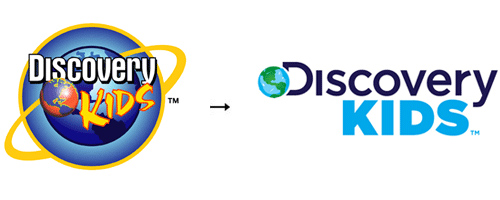
12 – DISCOVERY KIDS

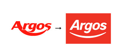
13 – Argos
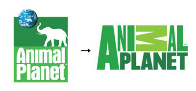
14 – Animal Planet
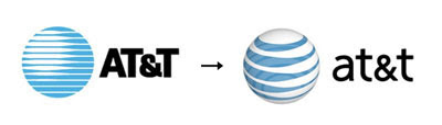
15 – AT&T
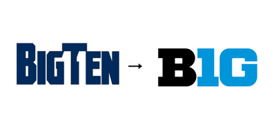
16 – BigTen

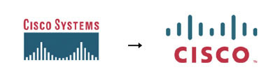
17 – Cisco System

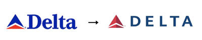
18 – Delta

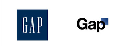
19 – GAP
20 – Google

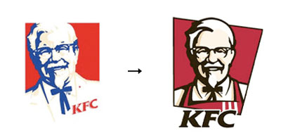
21 – KFC

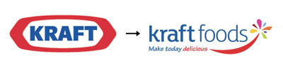
22 – Kraft
23 – MSN

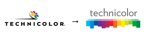
24 – Technicolor

The old PMP website was archaic, as was its general appearance. Over time, they evolved from a Foundation from research to an organization focused on three things – informing, researching and healing – so they needed to find a new approach.
NEW BRAND AND HOPE

This refreshed brand is hopeful, with goal-oriented messaging that excites a new generation of donors.
Success in your Fundraising…
Content extracted from the website: Wedologos.
